Vlog Thumbnail Design
Vlog Thumbnail Design. Make Them Stop Scrolling!
Let’s be real: a vlog thumbnail is basically your video’s pickup line.
People are scrolling at lightning speed, surrounded by a never-ending buffet of thumbnails…
and yours has exactly 0.7 seconds to shout:
👉 “HEY YOU! YES YOU! CLICK ME!”
A thumbnail isn’t just a cute picture.
It’s a mini movie poster, a tiny billboard, a digital wink.
Done right, it makes viewers curious enough to tap.
Done wrong? It disappears faster than your last diet.
🌟 Why Thumbnails Matter (More Than People Think)
A good thumbnail sets the tone before the video even starts.
It hints at drama, adventure, chaos, wisdom… or that one shocking twist.
Think of it like a whisper:
“There’s a story here. Come see.”
Big YouTubers don’t just luck into clicks.
They engineer them:
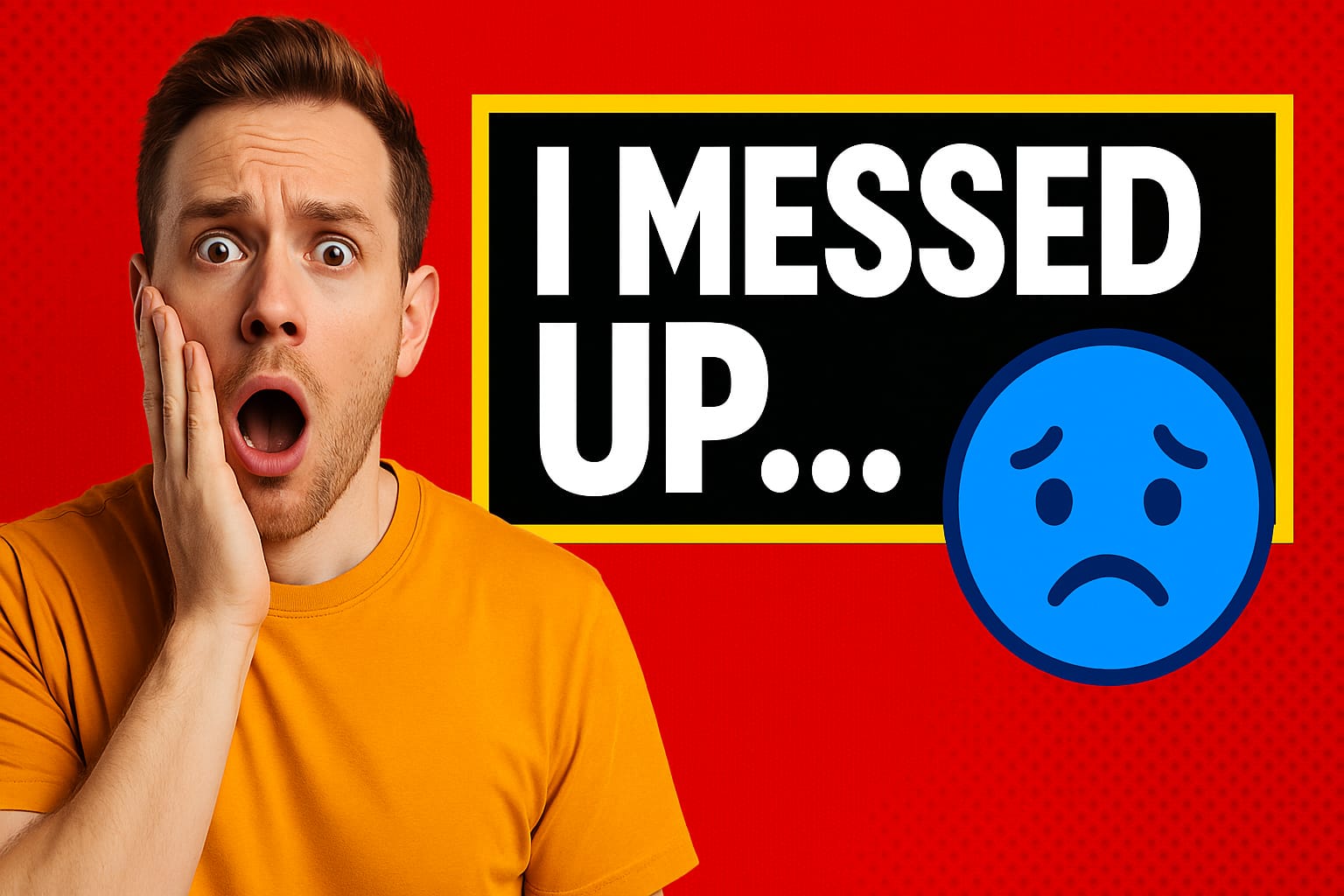
- Face expressions like “🤯😱😂👀”
- Freeze-frame weirdness (eyes mid-blink = instant comedy)
- Clean bold text (“I Messed Up… Badly”)
- Colors that punch the eyeballs (in a good way)
And the stats don’t lie.
Tests show great thumbnails can increase clicks by up to 50%+.
That’s basically giving your video a turbo engine on a crowded track.
🎯 How to Craft Scroll-Stopping Thumbnails
Here’s the cheat sheet to make your thumbnails irresistible:
1️⃣ Use bold, loud colors (neon-ish never hurts)
Think firecracker red, lemon yellow, electric blue.
Aim for contrast. If YouTube is the gray sky, you’re the rainbow screaming for attention.
Example:
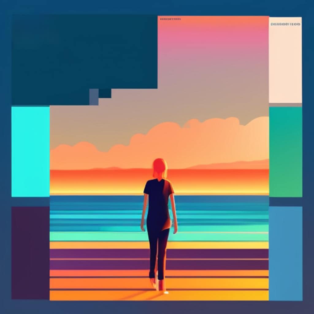
Travel vlog? Use bright turquoise oceans + golden sunlight.
Cooking vlog? Red chili + white background = pop!
2️⃣ Big text. Clear text. Short text.
Nobody is zooming in.
Use 2–4 words MAX.
Something that hits.
Examples:
- “I QUIT.”
- “DISASTER 😅”
- “3-MIN HACKS”
- “DON’T DO THIS!”
3️⃣ Keep your “brand look” consistent
Let viewers recognize you instantly, like spotting a friend in a crowd.
This doesn’t mean slapping a corner logo everywhere.
It means keeping a familiar:
- color palette
- font
- layout style
- vibe (funny, calm, dramatic, mysterious…)
Example:
All your thumbnails use a bright border + same font + you making silly faces = instant recognition.
4️⃣ Don’t clutter… tiny boxes hate chaos
A thumbnail is small.
Choose one main emotion, one main object, or one main moment.
Less = powerful
More = stressful
Example:
Instead of showing your entire kitchen…
show the ONE burnt pancake that ruined your morning.
5️⃣ Use emotion-rich images
Faces with emotions perform way better.
Surprise. Joy. Fear. Excitement. Confusion.
Or if your vlog is scenery-heavy:
show the MOST breathtaking moment.
Example:
That mountain peak shot where the clouds look like cotton candy?
Yes, THAT one.
🛠️ Best Tools for Creating Thumbnails (Even if You’re Not a Designer)
Canva : the crowd favorite
Simple. Fast. Tons of templates.
Drag-and-drop heaven.
Perfect for beginners or “make it in 90 seconds before upload”.
Adobe Spark : slick, polished, professional
More control. More customization.
Super for people who want movie-poster vibes.
Both offer free and paid versions 👍
💡 Pro Tips for Extra Click Magic
- Export at 1280×720 (YouTube’s sweet spot)
- Make sure it still looks good when tiny
- Add a subtle shadow behind your text to make it pop
- Test a few versions and… ask friends which one they’d click
- Don’t lie in your thumbnail… viewers hate betrayal 😆
🚀 Final Thought
Thumbnails are your vlog’s first impression, and first impressions matter.
With the right colors, a bold vibe, and smart tools, you turn casual scrollers into curious clickers.
A great thumbnail doesn’t just decorate your video…
✨ It sells the story before it even starts. ✨
The visual continuity artist GPT
Creates detailed, consistent-style images with precision.
