The Art of Color Palettes Explained with Bananas
Have you ever considered the connection between bananas and color palettes? Probably not, but stick with me because it’s about to get a-peeling! Just like a ripe banana transitions from yellow to reddish, color palettes are a fascinating spectrum of hues carefully chosen to convey specific messages or moods. In this blog, we’ll dive into the colorful world of design and illustrate the notion of a color palette with everyone’s favorite tropical fruit.
Banana Metamorphosis, A Palette Tale
Our journey begins with a close-up of a bright yellow banana. This humble fruit, as it turns out, is the perfect canvas to explain the concept of color palettes. As the banana slowly transitions to a deeper, reddish hue, so too does our understanding of color palettes evolve.
The Spectrum Connection
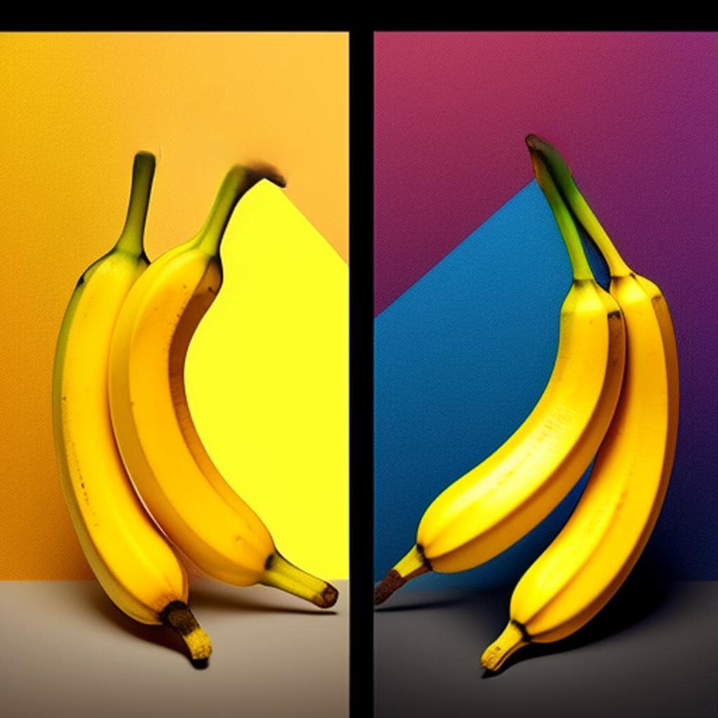
Imagine a split screen, with the banana’s transformation on one side and a color palette spectrum on the other. Just like the banana’s journey from yellow to red, a color palette encompasses a range of colors within a specific spectrum. It’s the artist’s toolbox, carefully curated to evoke emotions, convey information, or establish a brand’s identity.
Yellow & Red = Banana
Overlaying the video is a powerful message: “Yellow & Red = Banana.” It’s a reminder that just as a red or yellow banana is unmistakably a banana, certain colors are consistently linked to specific objects or ideas. Color association is powerful and immediate, much like our recognition of a banana’s distinct shape and color

Color Palettes in the Wild
After this fun banana analogy, we can explore real-world examples of color palettes in action. From corporate logos to movie posters, you’ll start noticing how specific colors are intentionally used to leave a lasting impression and communicate a brand’s essence.
Conclusion
In the end, the lesson is simple: Color palettes, much like bananas, can change, but their essence remains. They’re the secret sauce in design, branding, and communication. So, the next time you reach for a banana, take a moment to appreciate the artistry in its changing colors, and remember that in the world of design, color palettes are just as important and versatile.
Table that visually summarizes the relationship between the form (banana) and colors to explain the concept of a color palette.
| Aspect | Banana | Color Palette |
| Form | Distinctive banana shape | A curated collection of colors |
| Colors | Yellow -> Reddish | A spectrum of colors within a specific range |
| Association | Banana’s form is always recognized as a banana | Certain colors are universally linked to concepts |
| Purpose | The banana’s shape is inherent and unchanging | Color palettes convey messages or moods |
| Example | Visual transition of banana colors | Visualization of a color spectrum |
In this table, you can clearly see how the form (banana) and colors relate to the concept of a color palette. The banana’s form is associated with its inherent characteristics, just as certain colors are universally linked to specific ideas or objects. Meanwhile, color palettes are about a collection of colors within a spectrum that can be used to convey messages or moods in various design contexts. The table succinctly illustrates these relationships for easy comprehension.
Key Message: “The Form Is All”
In the colorful world of design and color palettes, the key message is clear: “The Form Is All.” Just as the distinct shape of a banana is always recognized as a banana, certain colors within a palette are universally linked to specific concepts or ideas. The essence of a color palette lies in its carefully curated collection of colors, much like a banana retains its inherent form. Colors may change and shift, but their form, their essence, remains the foundation upon which powerful and immediate associations are built. Whether you’re exploring design, branding, or communication, remember that in the world of color palettes, it’s the form that truly matters.
There you have it, a witty vlog and blog post that combine humor with a creative metaphor to explain the concept of color palettes. To make you think about colors in a whole new way!


